Designing a responsive website means creating a front-end that works and looks well on every device or browser with varying screen sizes (i.e., smartphones, laptops, tablets, and desktops). The reason it’s important to maintain is because of the fact that people spend an average of 4.37 hours per day staring at their smartphones, and more than 50% of these scrollers are just smartphone users.
Now it’s a separate debate why so many people are accessing websites through smartphones. But the main point is, these websites must have a responsive design to gain traffic from mobile users. And having so many smartphones of different sizes and form factors makes it difficult to choose the right screen size that suits you immediately.
To help you understand comprehensively about mobile responsiveness and its importance, we have written this ultimate guide on the responsive design checklist that you must follow in 2026. We will also discuss the difference between responsive and adaptive design.
What is a Responsive Design?
Based on the information provided by Gartner, the responsive website design is defined as the client-side technique to experience a multi-layout on a single web instance. However, it does sound a bit complex for a simple concept.
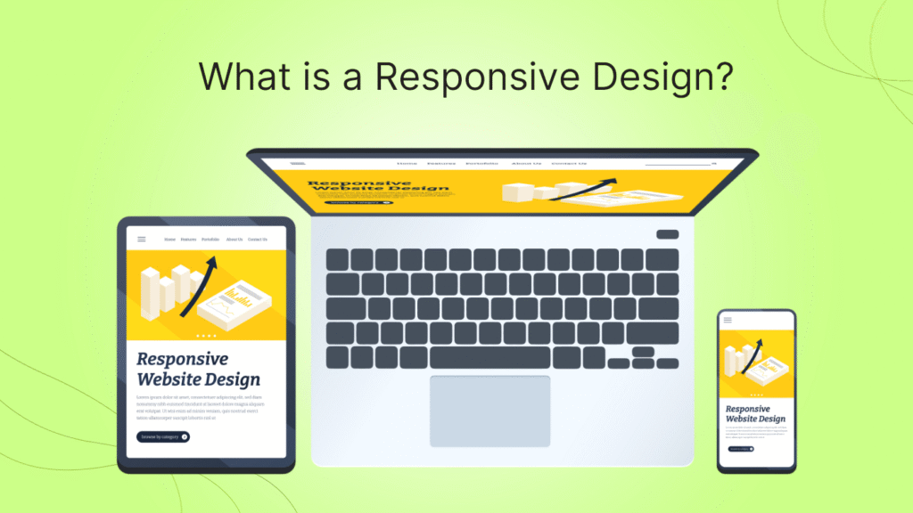
According to Octet Design Journal, a responsive website design (RWD) is an approach that ensures the website looks and works seamlessly across different screen sizes on different devices. Overall, the responsive website design is related to the graphics user interface, which is why it is supposed to automatically scale the contents and elements of the webpage as per screen size or device (without missing or cropping any content). The main advantage: you don’t have to design a dedicated website for mobile or any other device.
3 Main Components of a Responsive Web Design
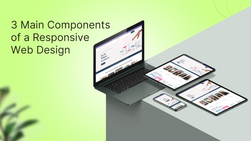
If you get the question in mind “how to make a responsive web design”, then the answer lies in these 3 essential components which help the design to respond for an optimized viewing experience.
Fluid Grids
A responsive web design is based on an algorithm that stabilizes the user-interface elements based on the number of pixels or the size of the screen. This function of a responsive web design is known as ‘liquid layout’, which is based on the percentage of width consumed by each component (block, images, and padding together) on the screen, making it up to 100%.
Media Queries
Media Queries are those filters that apply to CSS, which respond to the device type, screen type/size, and the browser in which the website is accessed. The concept behind media queries is to let different layouts use the same content block, where each block is optimized for the size or features of the device. Media queries ensure that the display layout is based on the minimum or maximum width parameters, including other factors such as screen resolution, browser, and orientation of the device (vertical or horizontal).
Flexible Fluids
Flexible fluids are the component according to which the images should be created in EPX (effective pixels) to denote the layout and spacing. Based on the perceived size, the elements of a responsive website should be designed with a base unit of 4 EPX. This calculation ensures that the design always scales to a whole number when the fluid grid is applied.
7 Essential Factors for Responsive Web Design
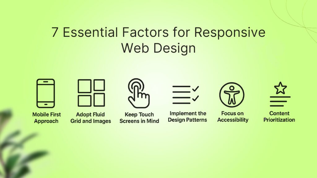
While working on a web design, if you are focused on designing a responsive web design, make sure to check the following points. These 7 essential factors will ensure that all the design elements on your web design remain flexible, including image, text, padding, and layout. Here is what you have to look for:
1. Mobile First Approach
When developing a responsive web design, make sure to always check for a mobile-optimized web design. Commonly, mobile-based websites suffer from the UX issues the most. Therefore, designing for mobile and scaling further will give you the best results in terms of engagement. Make sure the design remains intuitive in every screen layout and size.
2. Adopt Fluid Grid and Images
Generate images with the base of 4x EPX to make sure it scales according to various format percentages when transferred to fluid grid format. Make sure to test it across various formats, devices, and browsers (i.e., browsers, desktops, mobile devices, and other displays). Choose any device that may relate to your audience, including TV or smartwatches as well.
3. Keep Touch Screens in Mind
While designing an interactive yet responsive UI, make sure to keep the touchscreens in mind as well for the method of interaction. Three main things: Mouse, Keyboard, and Touch sensitivity. Your website interface should always be optimized for all these interaction types. Also, make sure that your website is usable on both small and large touch screens with simple navigation, responsive buttons and links, and adequate swipe space.
4. Decide Which Elements to Include
Responsive breakpoints should be featured by the designers while crafting the responsive website design to ensure that changes are applied to each layout styling. Based on the functionality that is going to be added to the design, decide which elements are necessary on the smaller screen size keep everything responsive.
5. Implement the Design Patterns
Responsive web design patterns are categorized into 5 different types according to Luke Wroblewski. These 5 types are fluid, column drop, layout shifter, tiny tweaks, and off-canvas. Based on these patterns, you can decide which blocks or columns can adjust from a multi-column to a single-column design pattern, the order of elements when the design shifts, and if the elements are hidden from the screen.
6. Focus on Accessibility
One of the main reasons why a website has to be responsive is so it can be accessible on multiple devices. Mainly, there are 4 principles of accessibility: perceivable, operable, robust, and understandable. When adjusting for mobile accessibility, make sure to keep the ratio 4.5:1 for normal text or 3:1 for large text. Also, the active elements on the page should be focusable, along with features that are not dependent on color contrasting, to be denoted.
7. Content Prioritization
Space is usually limited on small screens, and this is where designers have to get creative by keeping things concise yet scalable on small screens. Therefore, it’s important to enhance content that goes flawlessly on small screens as well. Here are some tips for designers to optimize content for small screens:
- Identify Key Content: Decide which content is the most important one to display and make sure it’s accessible on mobile devices.
- Streamline Layouts: Write clear headings and make content concise to make it easier for users to find what they are looking for.
- Optimize for Media: Make sure the images on the web page are responsive and do not cover the screen with overwhelming content.
By ensuring that the above-mentioned elements are covered in your responsive design, you are more than just ready to grab multi-channel visibility of your website, regardless of the devices your end users have.
Why is it Important to have a Responsive Website Design for Your Business?
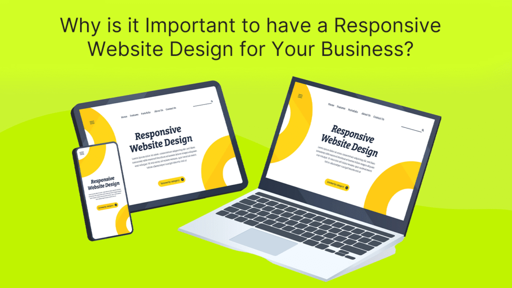
Responsive website design can earn a business a number of benefits. But here are the 7 main benefits that every business could gain:
1. Cost Effectiveness
With a responsive website design, businesses don’t have to spend time and resources to build a separate screen design for every device. A responsive website design just needs to be created once. Besides the up-front costs, you get long-term savings as you just have to make minor changes with the passage of time, in case of an update for support on a new device.
2. Better User Experience
Providing your customer, a fluent experience should be the number one priority of every business. With such a wide range of devices in the market, every user with a web browser accessible device has the potential to become your customer. With a responsive website design, you can prepare your website for viewership on any device (or at least most of them) without the need for unnecessary zooming or spaces.
3. Better for SEO
Believe it or not, websites with responsive designs get a thumbs up from search engines, which gives your business a competitive edge in the online race of search results. Moreover, it eliminates any SEO related risks that can arise due to having a separate mobile device. But here are two things you should always ensure in a responsive website design:
- Make sure there is no duplicate content; otherwise, your website might get de-indexed from Google.
- Make sure the website speed is up to par, as Google’s algorithm uses more than 200 ranking factors, and website speed with responsiveness is one of them.
4. Get Multichannel Visibility
With more and more users shifting towards handheld devices, businesses should focus on smartphone, tablet, and smartwatch users. According to a survey, more than 70% of the users who access a website via mobile are more likely to return to the website, and more than 60% of these customers would likely make a purchase. This is a responsive website design that helps to increase your sales.
5. Easier to Maintain and Develop
A responsive website design only needs to be designed and developed once. Further on, you just have to update it with the passage of time and make it according to the latest trends or updates of features. As a result, you just have to maintain a single design, and the changes would be applied across all devices for all users.
6. Enhanced for User Journey
On any business website, the user journey is one of the most crucial points that decides if a visitor will more likely become a customer. With a responsive website design, the user journey becomes more fluent and increases their chances of making a purchase. Moreover, separate website designs make it difficult for businesses to keep track of each one of them.
7. Increased Conversion Rates
More than 60% of the online retail traffic comes from mobile devices, and the rest of it is divided into various devices, including desktops or wearables. Now, if a website fails to convert customers, it means that there are flaws in their website’s design. According to a study, having a responsive website design can increase the chances of conversion by 10.9% increase with a higher number of visitors converting to buyers.
Responsive VS Adaptive Website Design: Are They the Same?
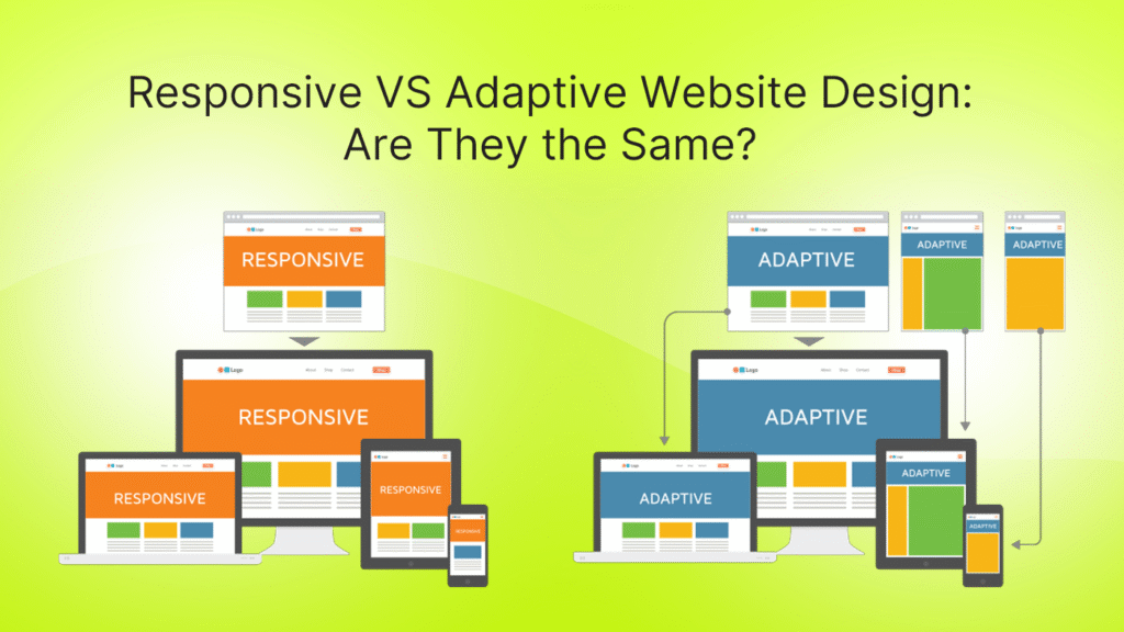
When developing a website for mobile or handheld devices, there are two main design types to consider: responsive and adaptive. Both of these designs serve the same purpose: to make the website optimized for smartphones with images, content, and a variety of screen sizes. But that does not mean these terms mean the same thing. Here is how responsive design is different from adaptive design:
Responsive Website Design
In responsive website design, the website’s elements are designed and developed to ensure that they perform well on every device size. But keep in mind that a responsive website design is a single design that adjusts according to the screen size of the device.
Therefore, it is faster and more cost-efficient to build. However, if a single mistake occurs in the design elements, padding, spacing, or anything, it can affect the whole user experience, especially for users with smaller screen devices.
Adaptive Website Design
The adaptive website design is exclusively built for each device. In the case of adaptive website design, the designers and developers have to build different website front-end designs for different devices. At the end, the server decides from which device the website is being accessed and then adjusts the design accordingly.
Hence, the adaptive website design costs more, takes more time, requires more time to maintain, making it costly as both a long-term and short-term investment. However, one benefit it offers is that the website design for its specific device is built to perfection.
FAQs
What are the main challenges of a responsive website design?
Even though responsive website design comes with a wide range of technical and lucrative benefits, one major challenge with designing a responsive design is that it requires a lot of time. Since designers and developers have to build something that has to operate on multiple devices, alterations and suggestions are overwhelming.
Which framework is best for designing and developing a responsive website?
The most popular choice is Bootstrap CSS, a framework that is commonly used for building responsive websites. The reason why Bootstrap is so popular for responsive websites is that it offers ready-to-use components and a responsive grid system that you can easily customize according to your needs.
Is Tailwind Better than Bootstrap for Building Responsive Designs?
Both Tailwind and Bootstrap offer their own sets of benefits when it comes to building a responsive website design. Bootstrap offers a quicker and more user-friendly way to connect with pre-built components. On the other hand, Tailwind offers better design flexibility through any classes. Still, designers and developers commonly choose Bootstrap.
What are the main techniques used for a responsive website design?
The main factor to consider in responsive website design is using relative units for sizing and media queries for conditional styling. The responsive website design heavily relies on the HTML and CSS of the website.
What role does mobile-first design play in modern responsive strategies?
Mobile-first design means creating layouts with smaller screens in mind before scaling up to larger devices. This approach ensures that essential content, navigation, and performance are prioritized for mobile users. In 2026, with over 70% of global traffic coming from mobile devices, mobile-first design isn’t optional—it’s the foundation of responsive web development.
How can I test if my website is fully responsive?
You can use tools like Google’s Mobile-Friendly Test, Chrome DevTools, or services like BrowserStack to preview your site across multiple devices and screen sizes. Additionally, manual testing on different phones, tablets, and desktops ensures accuracy. A strong responsive checklist should include testing breakpoints, touch interactions, and performance on slow networks.
How do accessibility and responsive design work together?
Accessibility ensures that websites are usable by people with disabilities, while responsiveness ensures usability across devices. When combined, they create inclusive digital experiences. For example, using scalable fonts, proper contrast ratios, and keyboard navigation helps ensure a responsive design is also accessible to screen reader users and those with vision impairments.
Conclusion
A responsive website design offers a wide range of benefits, and it has become strictly crucial for businesses nowadays due to the variety of browser-supportive devices. From the console screens in the cars to the smartwatches on our wrists, every user with a web browser-capable device can become a potential customer of your business.
As mentioned in this article, building a responsive website design can earn you a number of benefits. With a complete checklist for responsive website design and main elements to look for, you can build a website that performs well across all devices. However, keep in mind that building a responsive website design depends heavily on the communication between the client, designers, and developers, so remain transparent in it.